Stockpile
Online Stock Trading for Adults and Children
I worked as Stockpile's only design resource for about three months, during which I tackled a variety of design tasks. Featured below are the homepage redesigns and dashboard redesigns that I did.
Stockpile is a fintech startup that provides online stock brokerage services to adults and kids. The company also has a gift card product that enable customers to send fractional shares of stocks to their friends and family as a gift.
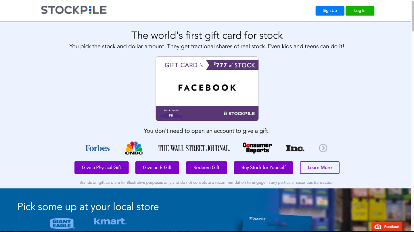
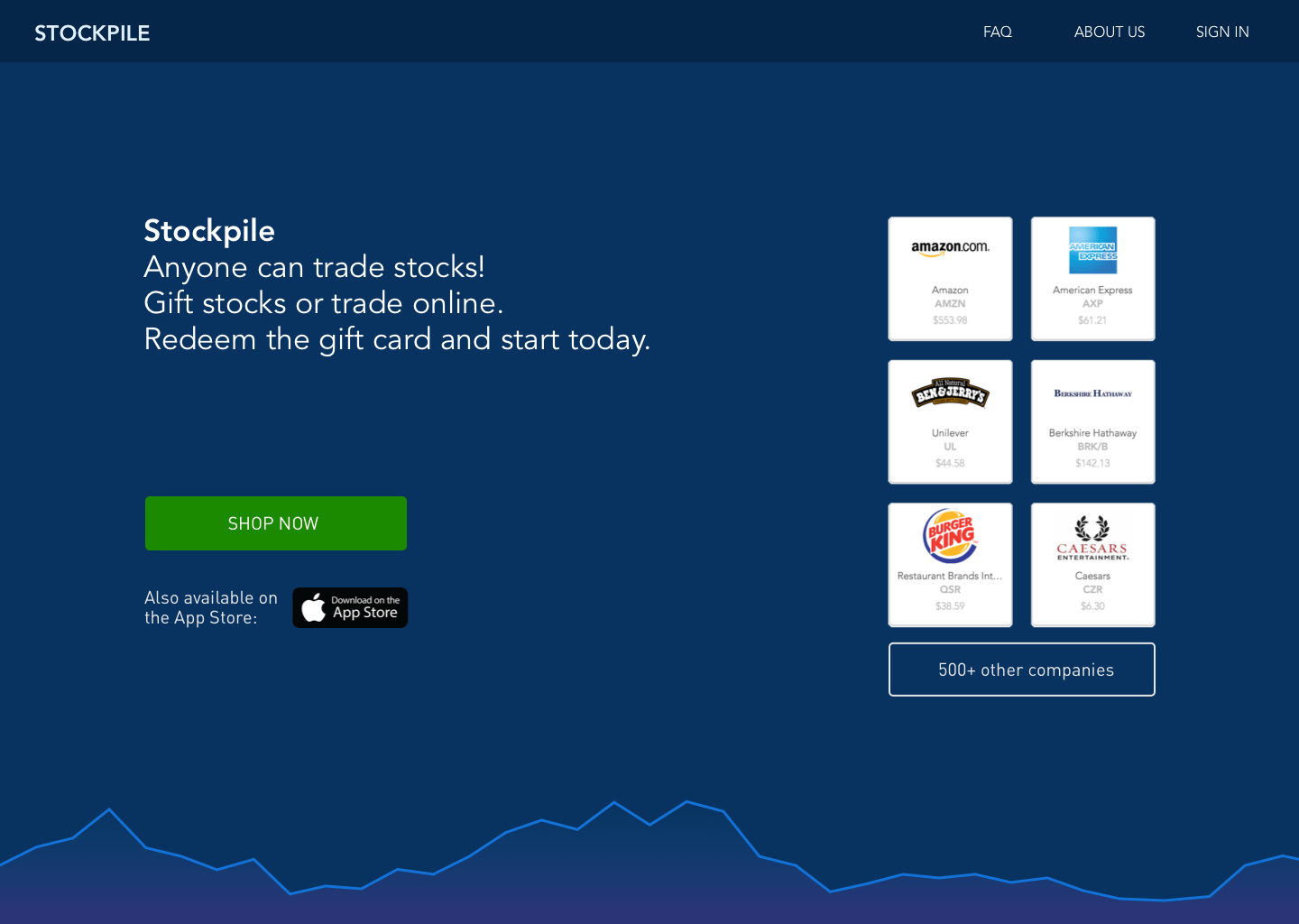
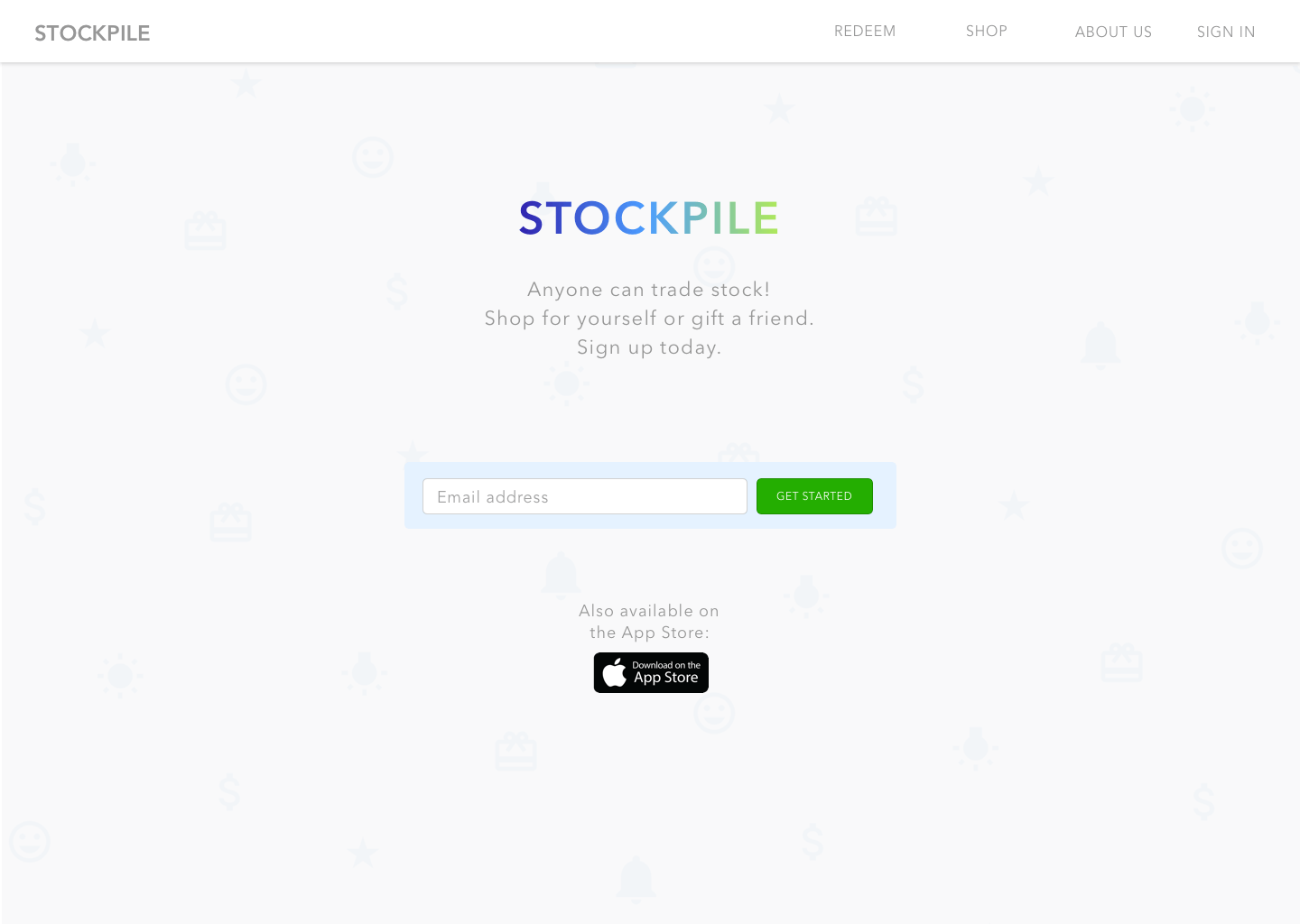
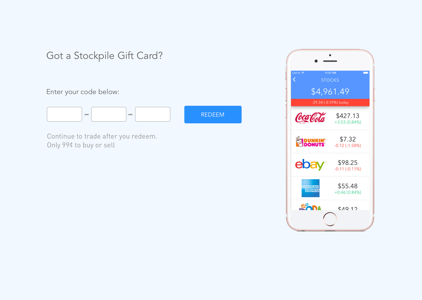
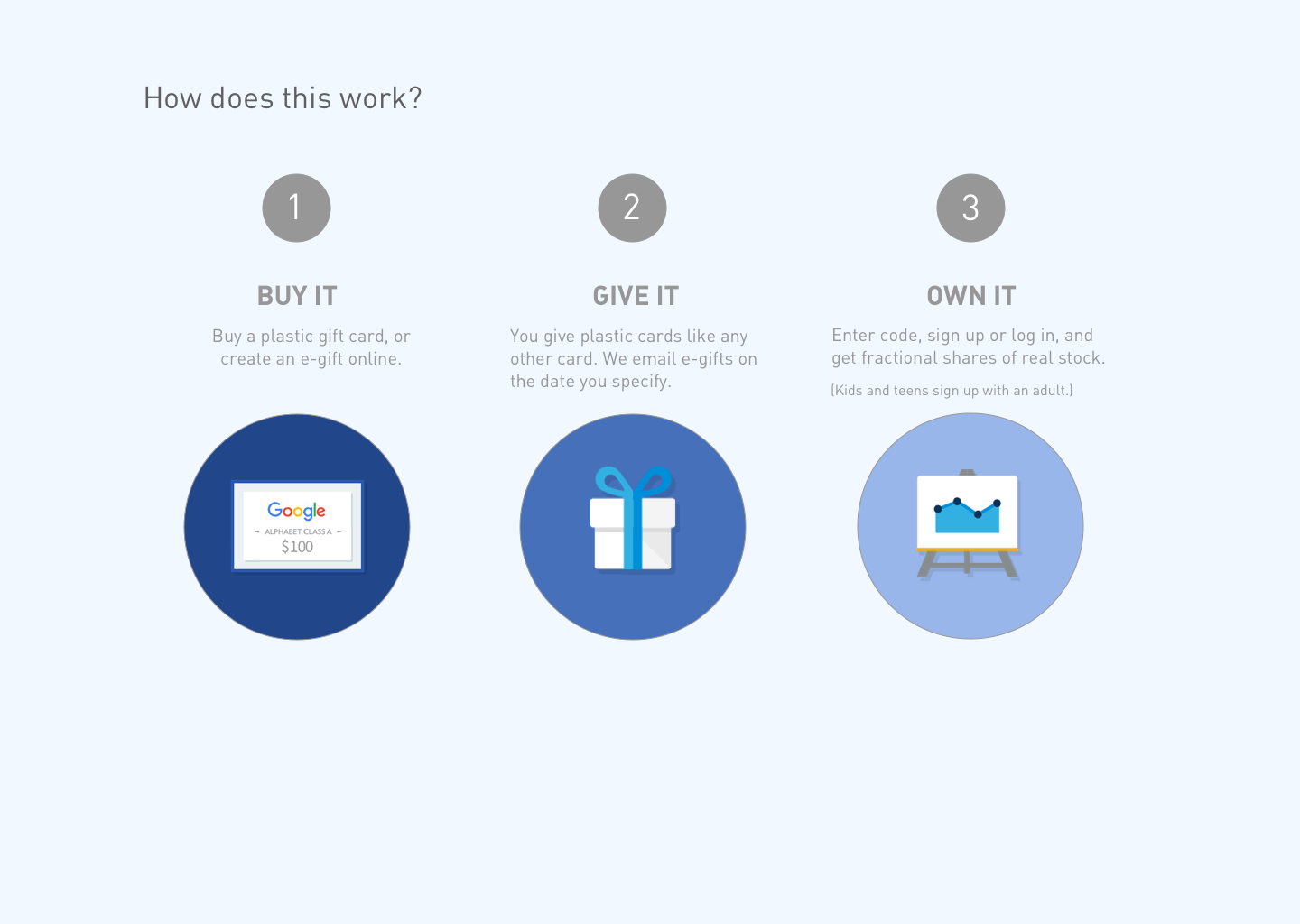
Homepage
Stockpile needed a major homepage overhaul. The visual and UI designs were outdated and there were too many CTAs on the top section of the homepage that could be reserved for a more visually appealing, interactive experience.
Project Context
We want to evoke a sense of professionalism but also cater to a younger audience to show that stock trading is not an intimidating activity and is accessible to everyone (since we have customers under 18). Based on some analysis, customers have four major use cases when they visit our homepage: 1) they land on our page through organic traffic or ads and want to know what we are about 2) they've received a gift card and would like to redeem it 3) they want to order a gift card for someone else 4) they simply want to open a brokerage account or log into their existing account. I looked into similar product website homepages to draw some inspiration and came up with a couple mocks that fit the mood we were going after.
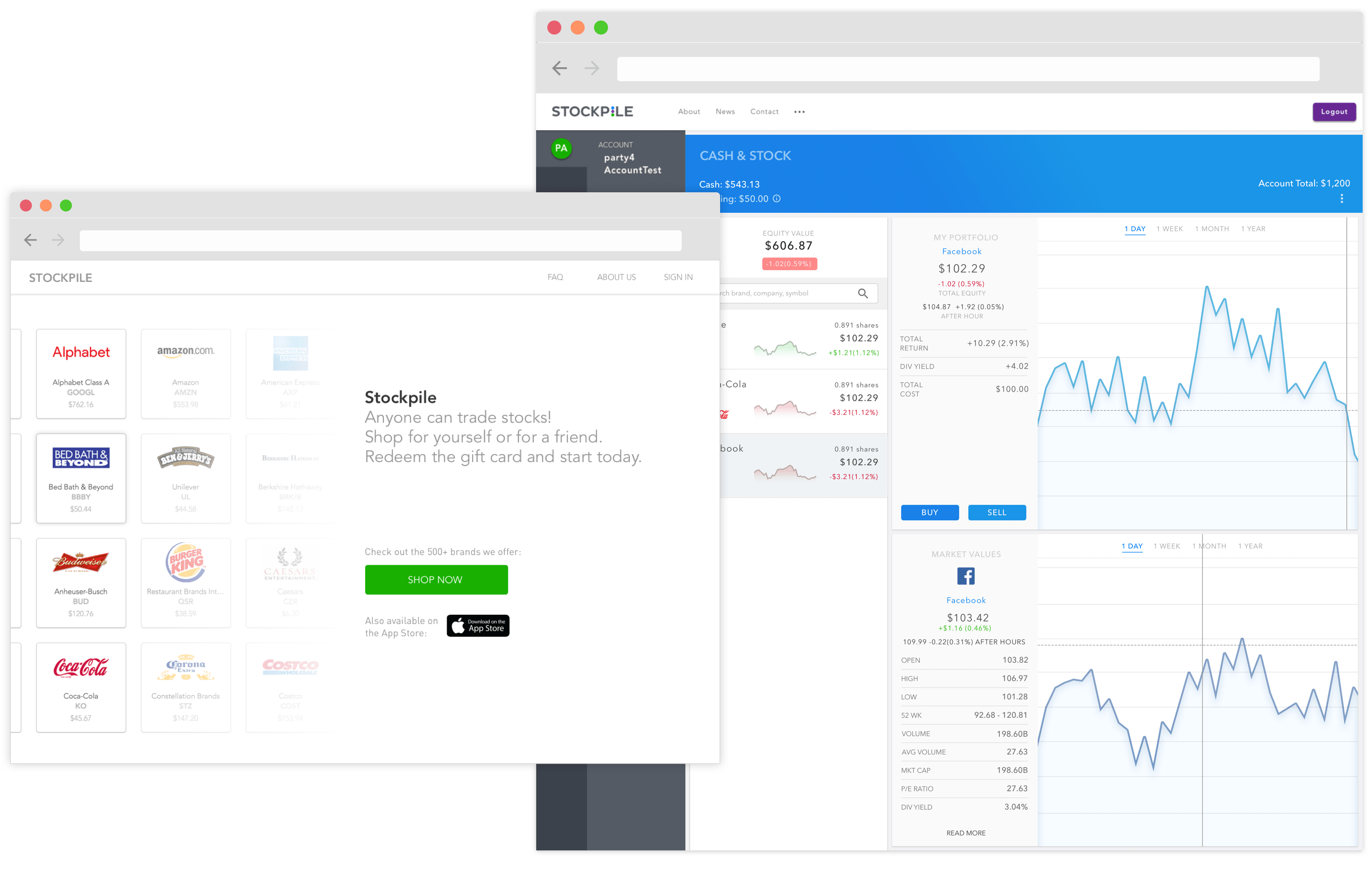
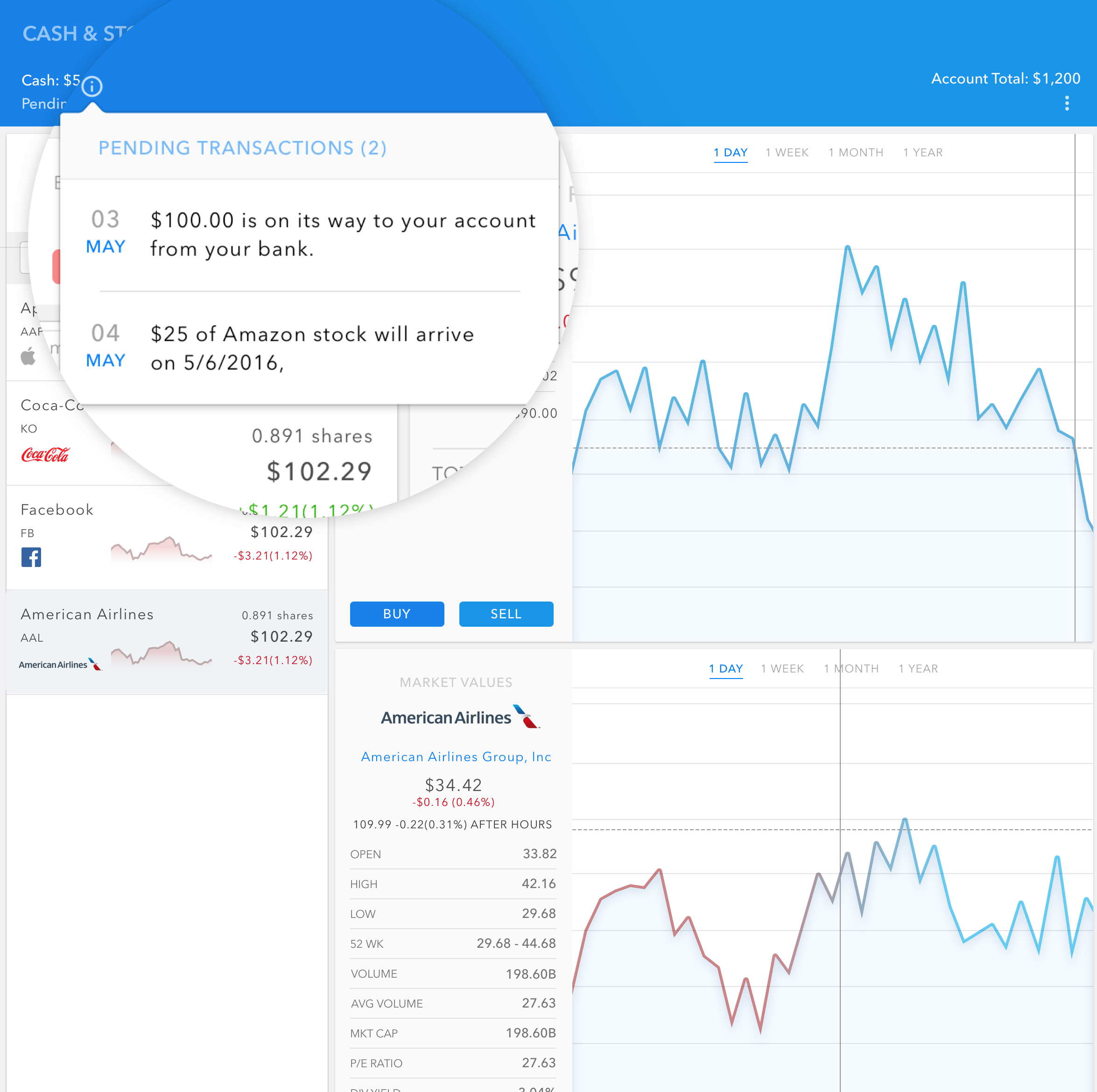
Dashboard
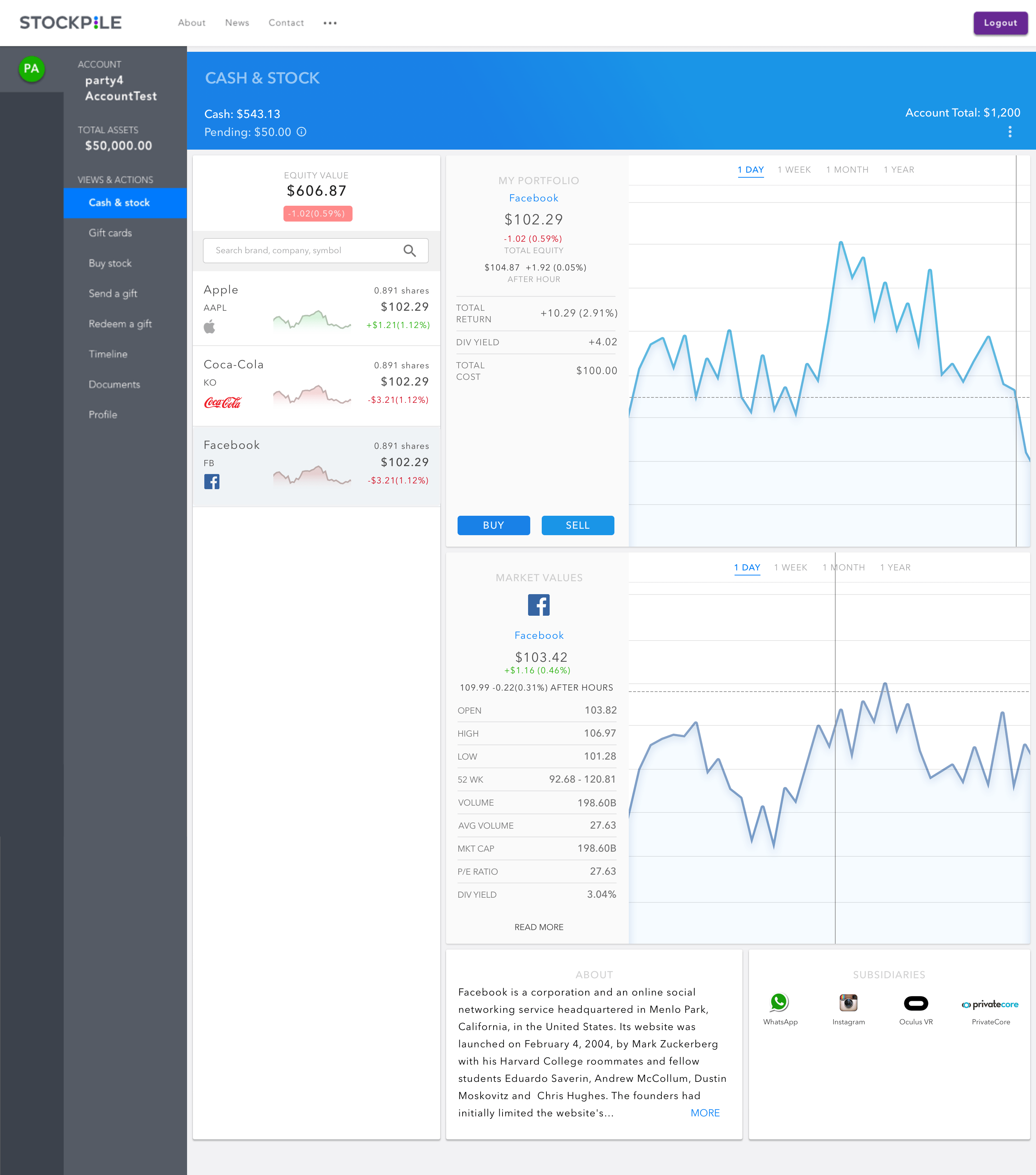
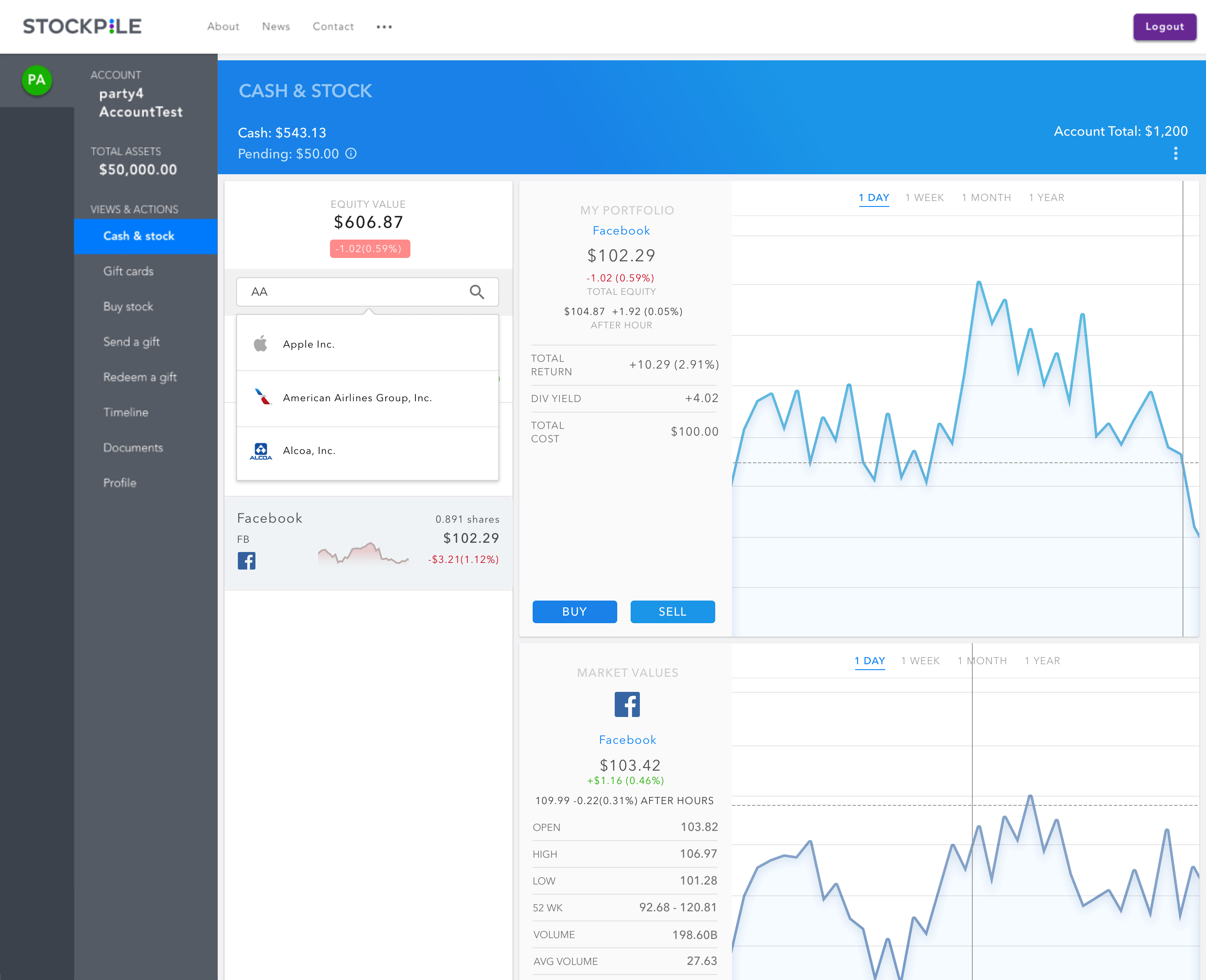
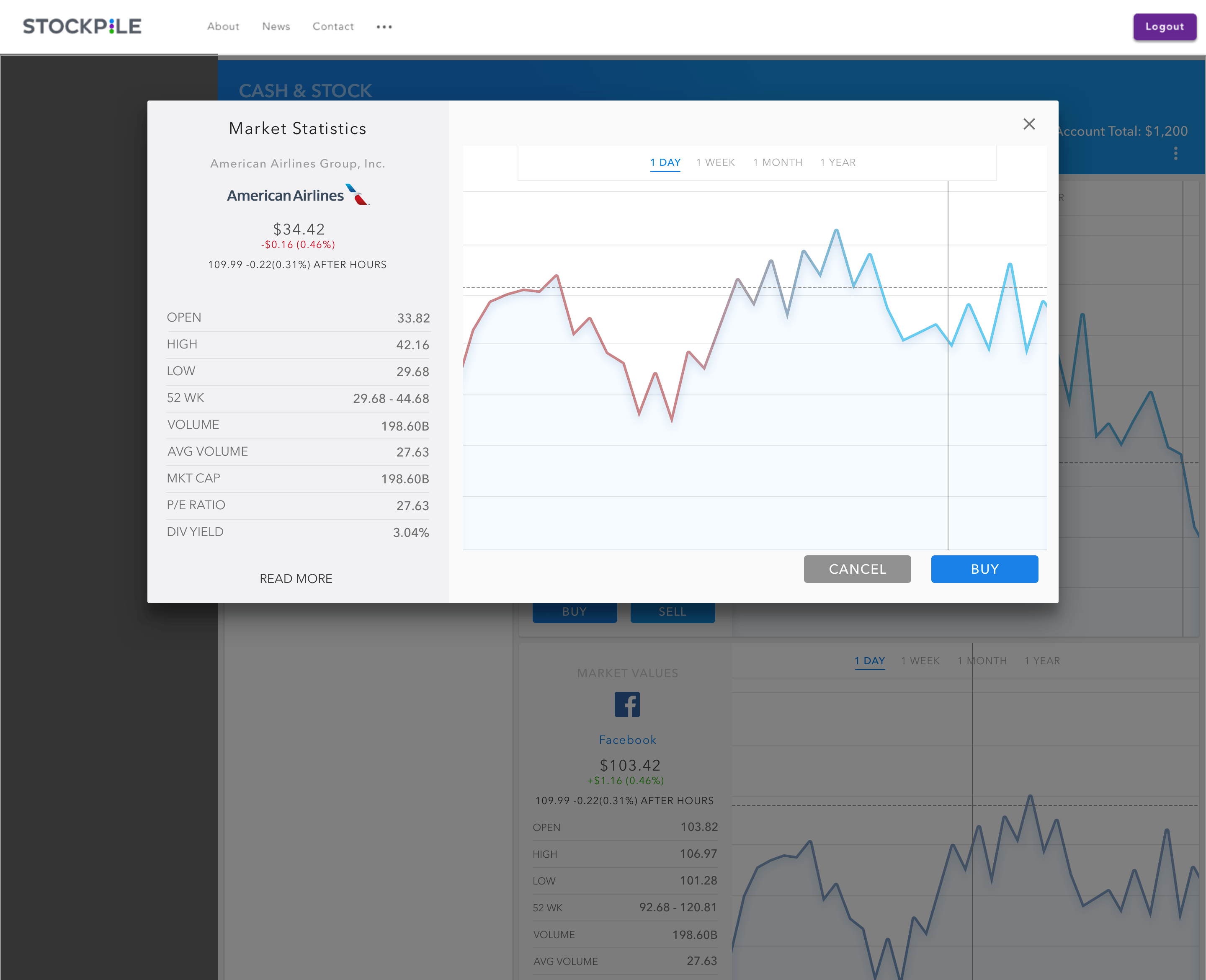
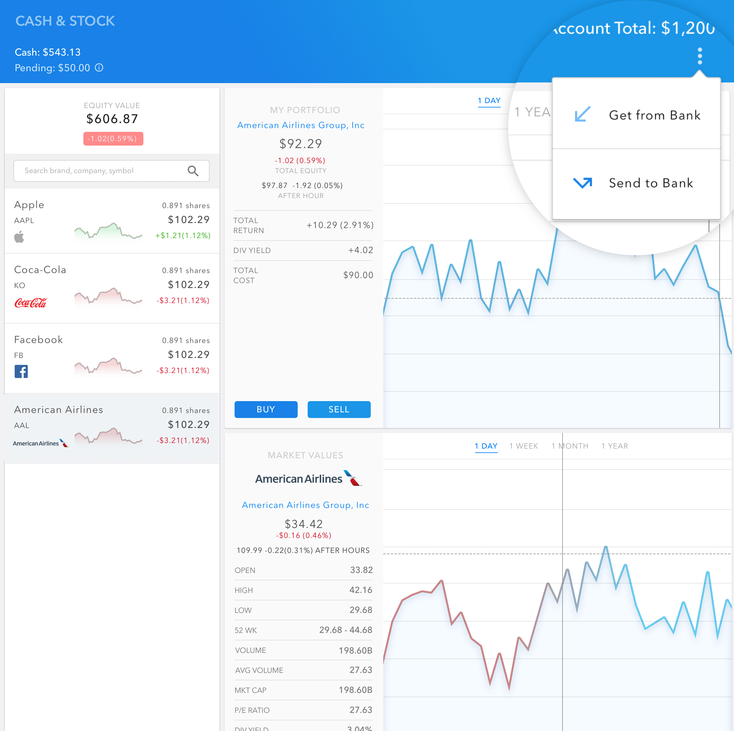
The portfolio dashboard is one of the most important and most visited pages for existing account holders. We want our customers to not only get a quick summary of how their portfolio is performing, but also include additional features that can help them make informed decisions about each stock without leaving our page (ie. go to Google or Yahoo Finance instead).
I researched various dashboard designs online and also look at existing websites that have similar dashboard concepts. A huge selling point for our products was the brand recognition that comes with the gift card purchase - therefore, company branding is an element I incorporated into the design. I explored various ways to utilize companies' logos and color schemes on the page. Overall, I did two major iterations on the design.
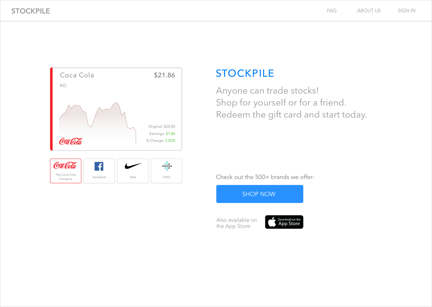
Iteration 1
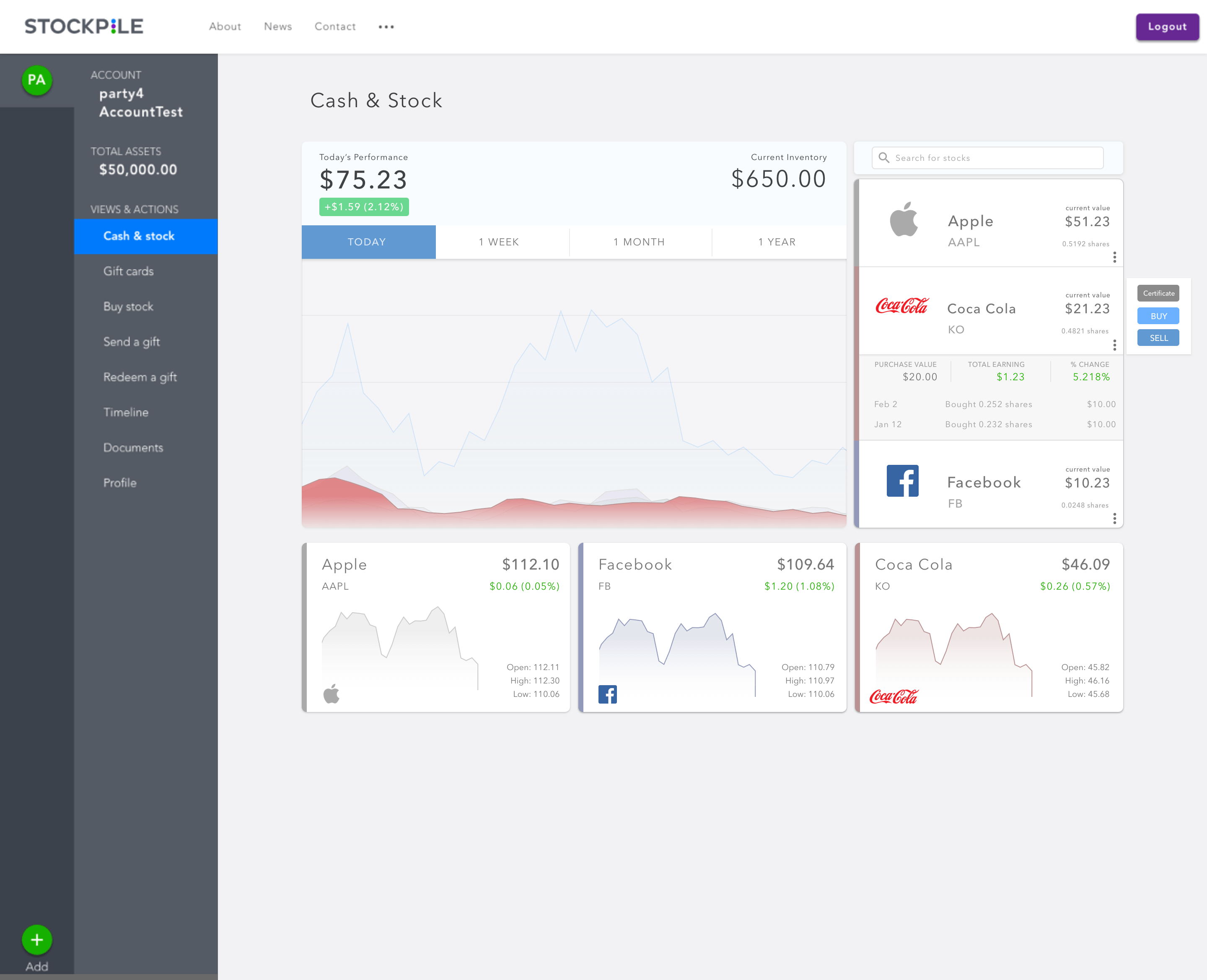
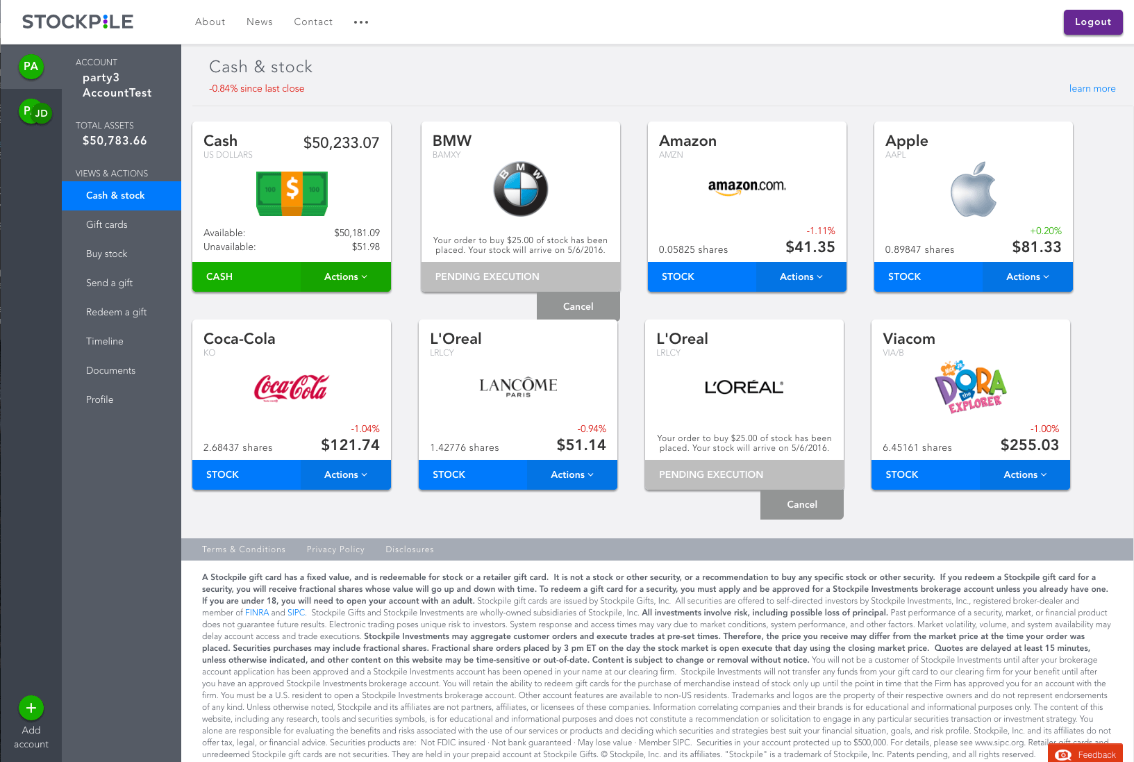
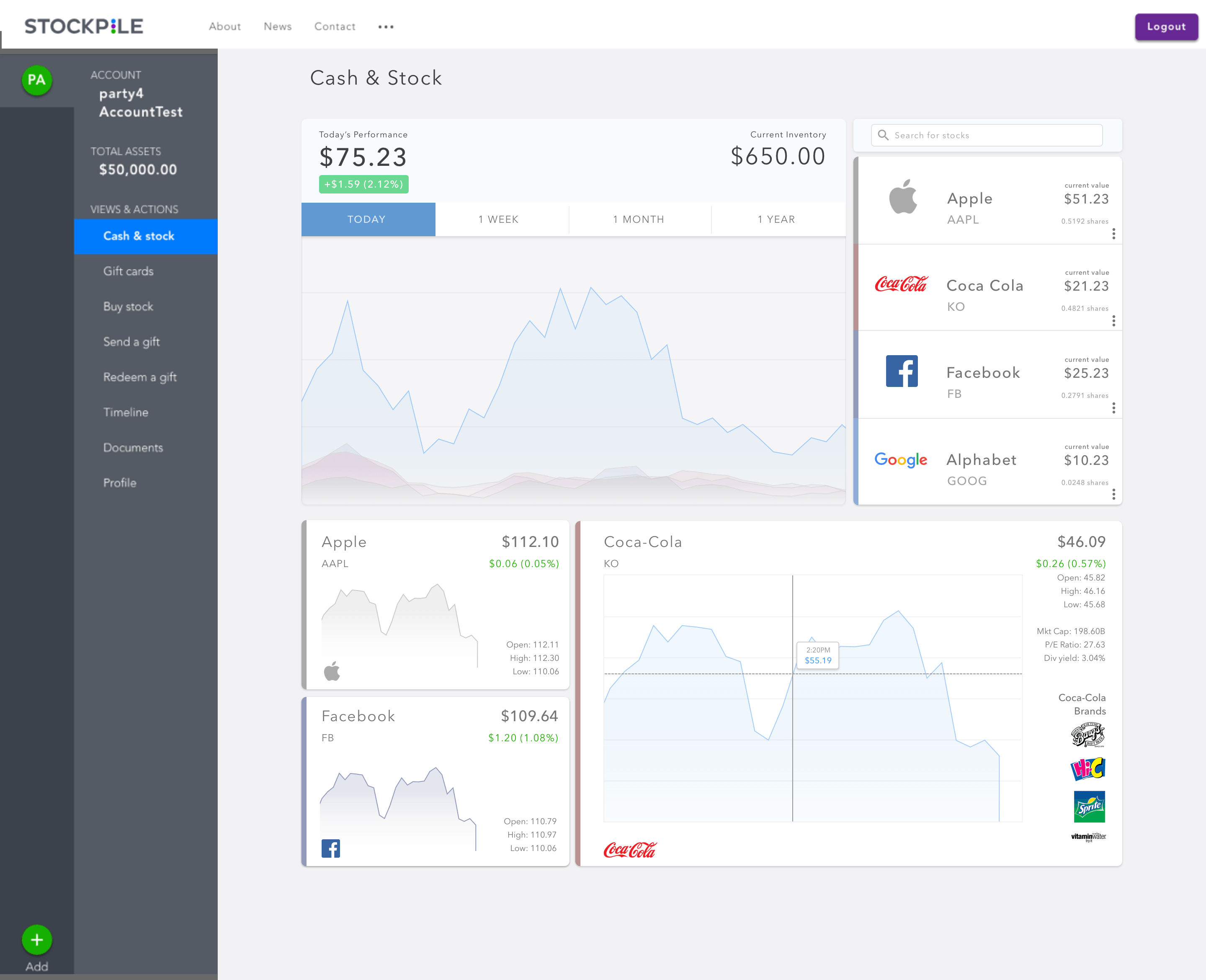
I started out my first iteration by rethinking the relevance of the card-like UI representation of each stock and decided that the concept played nicely along with the actual gift cards we sell. My initial designs retained the card concept and focused on the ownership of more cards on the screen. However, some concerns around this design include: 1) the scatteredness of the stock data for each company 2) the redundancy of stocks information between the companies of interest (on the right side of the graph) versus the owned stocks (below the graph) 3) lack of scalability for new features.
Iteration 2
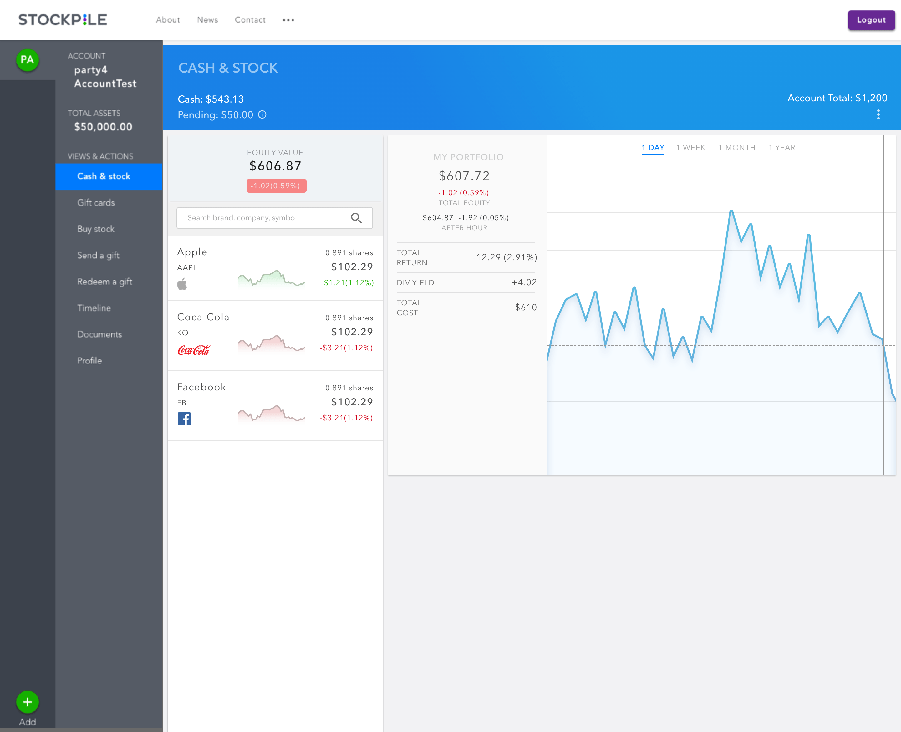
With the second iteration, I took a different approach. The CEO described his vision of a data-heavy dashboard that the user can perform various portfolio functions with: 1) users should be able to see his/her portolio standing immediately 2) compare the performance of each stock 3) explore other stocks of interest. He presented several designs he found online that he liked and based on those designs, I made a second attempt at incorporating these elements.
During the next several crits, it was determined that the scale of this project had ballooned so much that more effort needed to be spent on determining engineering feasibility before moving forward with design decisions.